
Famille Percher Wine Labels
Art Direction ∙Branding & Strategy ∙ Package Design ∙ Print
Super Glou, Minum Selection’s wine import partner, aimed to introduce Famille Percher's wines to the American market but needed assistance in crafting a distinctive brand identity.
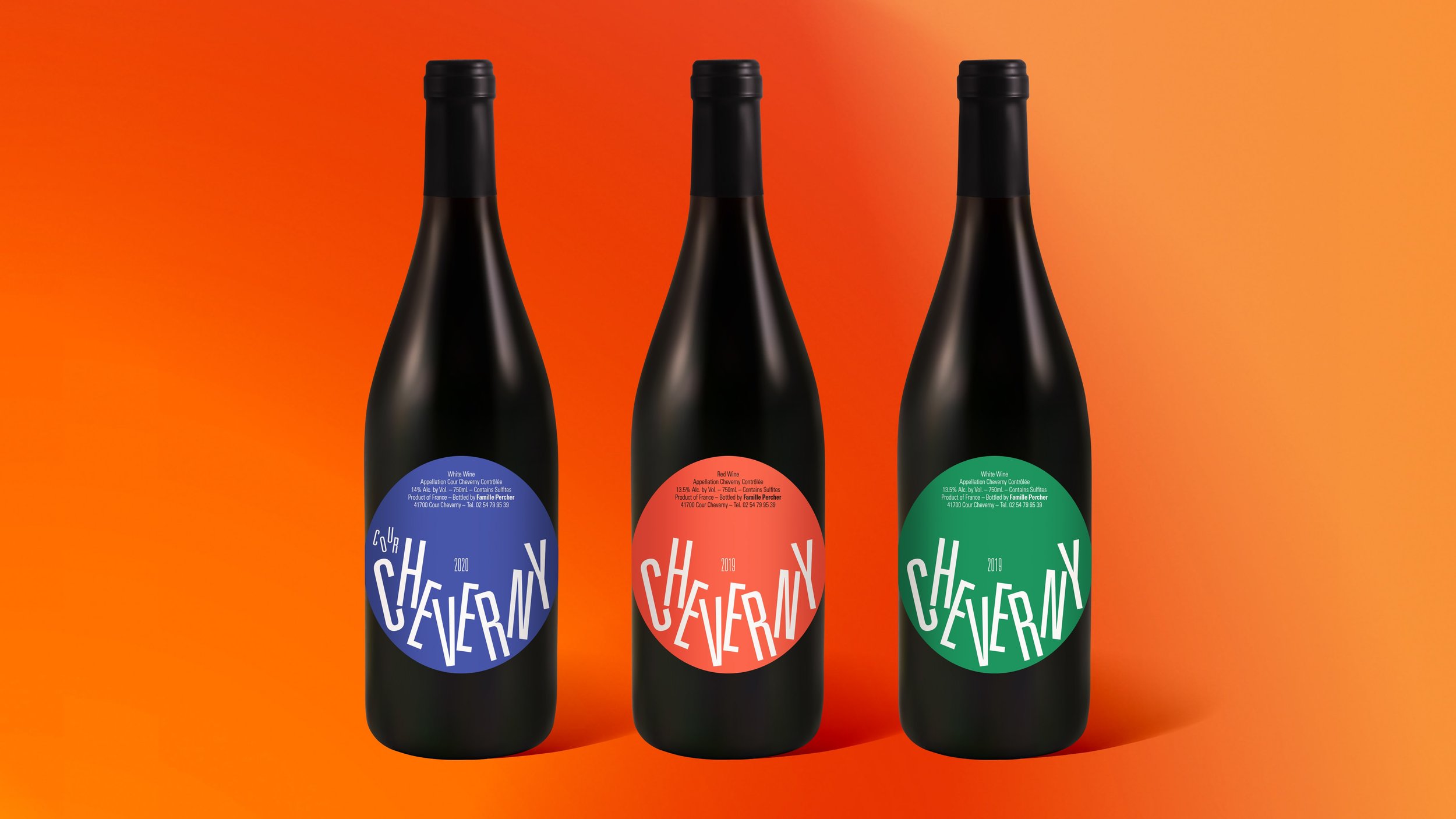
Drawing upon my expertise in typography, this creative concept is inspired by the winemaking process. The letters bob and dance, much like fermenting grapes in a barrel, initiating a visual fermentation reminiscent of the iconic movie titles designed by Saul Bass. The circular label shape introduces a visually unique element, reminiscent of the center labels on vintage LPs. I incorporated standard French language to establish trust with knowledgeable consumers, presented in a playful manner to engage and entice those newer to the world of wine.
Spinning about like an old record and dancing like fermenting grapes.


RGB in real life.

